
Most B2B customer service teams already have dashboards. They can see ticket volumes, response times, open cases, perhaps NPS or CSAT. The problem is not a lack of reporting. The problem is that the report often stops just before the useful question: what should we do differently because of what we can see?
That gap matters more in B2B than in many consumer environments. One account may represent several contacts, contracts, service locations, invoices, delivery commitments and communication preferences. A late answer is not simply one unhappy customer; it can affect a renewal, a payment, an operational deadline or an entire commercial relationship.
The dashboard should mirror the customer relationship, not the org chart
Service data is usually split by system. CRM knows the account and relationship. The ticketing platform knows the case. ERP knows orders and invoices. A communication platform knows what was sent. Marketing automation may know engagement. Each system reports its own truth.
As our article CCM, CRM, and Marketing Automation: Who Does What? explains, these platforms have different centres of gravity. The dashboard becomes valuable when it joins the relevant signals around the account or journey instead of forcing the service team to reconcile them manually.
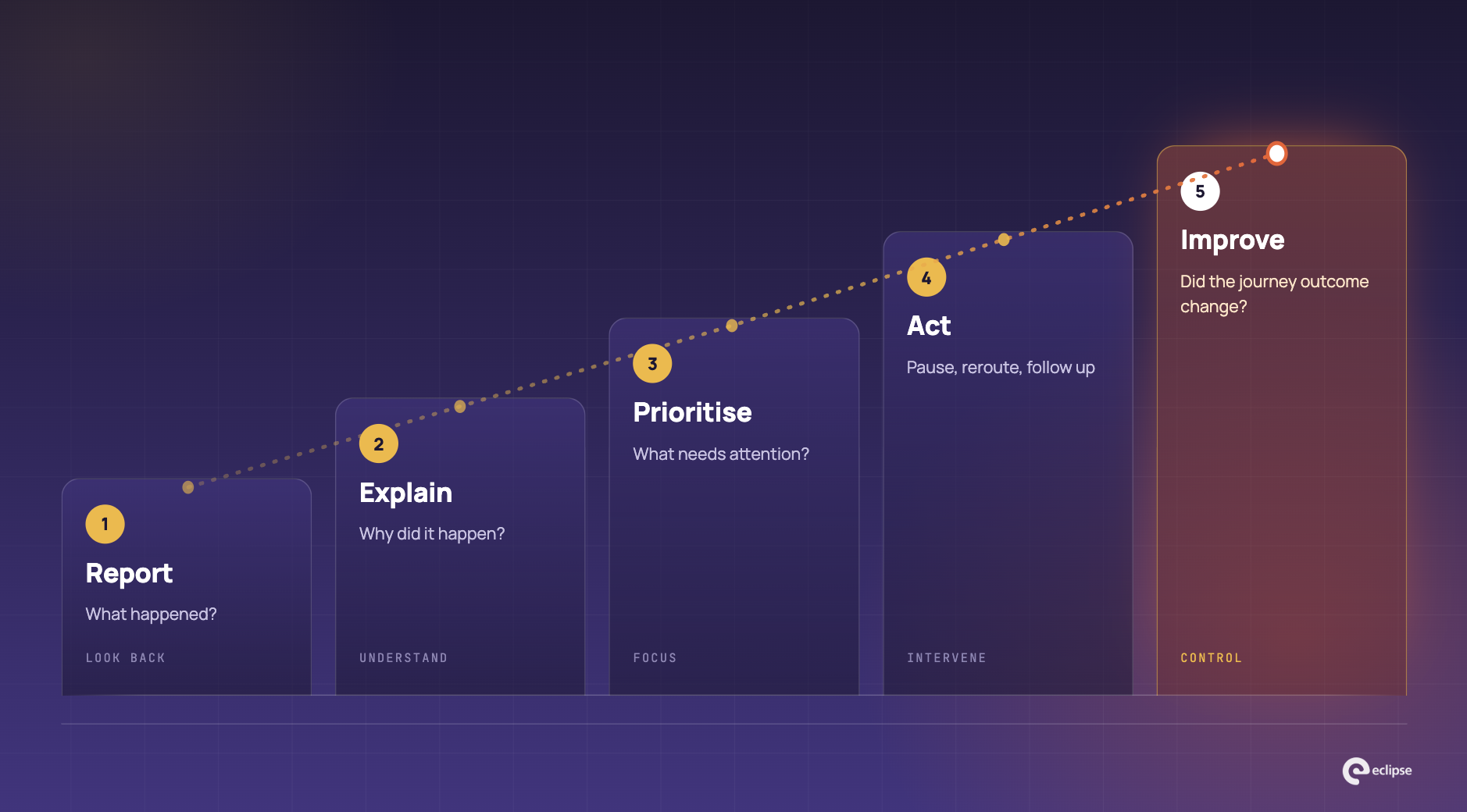
Five levels of dashboard maturity
1. Report: what happened?
This is the familiar layer: number of cases, average response time, communication volume, channel mix, delivery success. It is necessary, but retrospective. It tells you where you have been.
2. Explain: why did it happen?
A better dashboard adds context. Response time rose because one service line had a backlog. Failed communications increased after a data-source change. A spike in calls followed a confusing invoice. The team can move from observation to diagnosis.
3. Prioritise: what needs attention?
B2B service becomes more effective when the dashboard highlights risk, not just volume. Which strategic account has an unresolved communication failure? Which SLA will breach today? Which contract renewal is waiting for customer action? Which invoice reminder has reached the third attempt without response?
4. Act: what can we change from here?
The Eclipse Insights dashboard is designed around the communication chain and allows users to track and analyse communication activity. Because the dashboard is connected to the underlying process, teams can also intervene in communication flows rather than merely export another report.
5. Improve: did the intervention change the outcome?

This is the level many dashboards never reach. A team changes the reminder timing or channel. Did the outstanding action rate improve? A new invoice explanation is introduced. Did clarification calls fall? A service alert is moved from email to SMS for a particular customer group. Did acknowledgement improve?
The dashboard becomes part of a continuous-improvement loop rather than an end-of-month ritual.
What should a B2B customer service dashboard measure?
| Area | Useful metrics | Why it matters |
|---|---|---|
| Account health | Open critical issues, overdue actions, repeated exceptions | Shows relationship risk, not only case volume. |
| Communication | Delivery failure, open/response status, outstanding requests | Shows whether customers actually received and acted on key messages. |
| Service flow | Time to first response, time to resolution, SLA-at-risk | Makes operational risk visible before breach. |
| Customer effort | Repeat contacts, channel switches, missing-data loops | Reveals friction that average handling time can hide. |
| Commercial moments | Renewal tasks, invoice response, consent or contract completion | Connects service execution with revenue and retention moments. |
| Change agility | Time to update content, workflow or channel logic | Shows whether teams can respond when requirements change. |
Do not confuse more data with more insight
A dashboard can become unusable by trying to satisfy every stakeholder. The result is twenty widgets, six filters and no clear hierarchy. The better design begins with the decisions a service team makes each day.
A manager may need account-level risk and SLA performance. A communication specialist may need channel failures and scenario status. A service employee may need the last messages sent to one customer. An operations lead may need outstanding batches and exceptions. The same underlying data can support different views.
Eclipse builds tailor-made KPI-BI dashboards around the goals and roles that matter to the organisation, with real-time information and links to external data where required.
Communication data is often the missing layer
Service dashboards are usually good at cases and weak at communications. Yet many service problems begin with a message: the invoice was confusing, the reminder did not arrive, the customer missed a portal notification, or a contract document was sent to the wrong contact.
Because Eclipse manages the communication chain from data to distribution, its Insights layer can provide history at individual-customer level. That gives the service team evidence of what was sent, through which channel and where the process is now.
For B2B service, this can be extended to account context. A service agent should not need to ask the customer to forward the email they received just to understand the problem.
The dashboard is only as good as the integration underneath it
Real-time views built on overnight spreadsheets are not real-time. A dashboard that cannot reconcile account identifiers across CRM, ERP and communication systems will produce attractive inconsistency.
Eclipse uses application integration and a Canonical Data Model to structure and validate the information used across the communication process.
Turn insight into journey orchestration
The most important leap is from “we can see the problem” to “the process responds to the problem”. If a communication fails, the workflow should select a fallback. If a customer completes the action, reminders should stop. If an SLA is at risk, the account team should be alerted before the customer escalates.
Scenario management and flexible customer journeys make those next actions part of the process design.
A simple dashboard design rule
Every widget should answer one of four questions: What changed? Why does it matter? Who owns the next action? Did that action improve the outcome?
If a metric cannot support one of those questions, it may still be useful for analysis, but it probably does not deserve prime space on an operational service dashboard.
How Eclipse supports B2B service visibility
Eclipse brings together communication data, source-system integration, journey logic and operational dashboards. That combination is useful for B2B organisations because the service relationship is rarely contained in one application.
- Connect CRM, ERP, billing, service and communication data.
- Create role-based real-time dashboards around the KPIs that matter.
- See communication history and outstanding actions in journey context.
- Use scenario logic to automate reminders, fallbacks and escalations.
- Measure the effect of process changes rather than stopping at activity counts.
For related reading, see The Impact of Modern CCM Solutions on Operational Efficiency and Beyond Boundaries: How CRM Integration with CCM Platforms Empowers the Enterprise.
Conclusion
B2B service dashboards should not become prettier spreadsheets. Their purpose is to reduce the distance between a signal and a useful response.
When account context, service status and communication history are visible together, teams can prioritise the right work, intervene before an SLA fails and learn whether their changes actually improved the customer relationship. That is the difference between reporting and operational control.
Frequently asked questions
What makes a B2B service dashboard different from a B2C dashboard?
B2B service often involves complex accounts, multiple contacts, contracts, SLAs and commercial dependencies. The dashboard must preserve account context rather than treating every interaction as an isolated customer event.
Which metrics should appear first?
Prioritise metrics tied to decisions: SLA-at-risk, unresolved critical issues, failed communications, outstanding customer actions and repeat-contact patterns.
Should NPS or CSAT be included?
They can be useful, but they should sit alongside operational and journey measures that explain what created the experience.
Why include communication data?
Many service issues begin with something the organisation sent or failed to send. Seeing communication history helps service teams resolve the case with context.
Can dashboards trigger actions?
The strongest setup connects insight to workflow. A risk or failure can trigger a reminder, fallback channel, alert or human escalation.
How does Eclipse support B2B dashboards?
Eclipse combines real-time management dashboards with communication-chain insight, integration, a Canonical Data Model and scenario orchestration.